Here's a nutty idea: designing terrible solutions makes you a better designer. I know that sounds backwards. Designer portfolios share only the most pristine of examples. And we’re taught about efficiency and time savings. Best practices tell us to move fast, fail fast, and get to good solutions quickly. So why waste your time thinking about the worst possible option?
Just a few weeks ago, I was working with my team to reinvent a complex workflow. We were struggling a bit. Stuck in the land of “today.” Instead of jumping straight into "good" solutions or what might be better, I provoked the team by asking to produce a deliberately "bad" version.
What happened next surprised us all. As we looked at what we thought would be terrible solutions, we discovered they had some redeeming qualities. Elements that seemed obviously bad at first glance turned out to solve problems we hadn't even identified yet. Our "bad" solutions were teaching us about the problem space in ways our "good" thinking never could. Plus, as we intentionally worked towards a “bad” option we better understood what did and didn’t work for the user.
That terrible solution acted as a powerful filter for what it means to be “good”. The critical point was that we knew we were creating terrible options.
The Single Option Trap
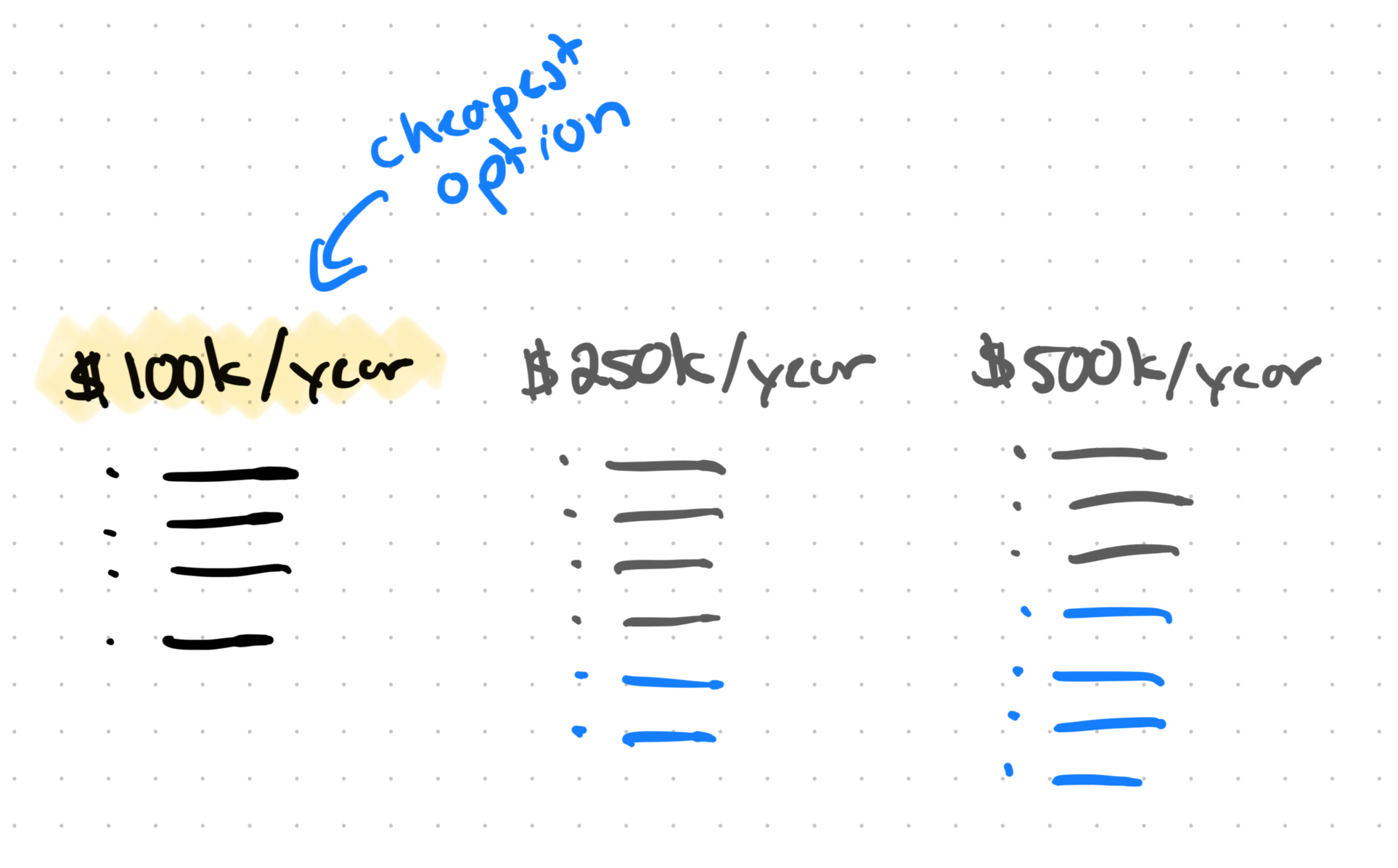
Most of the time we think we’re exploring when we’re really just optimizing minor variations of one "good" solution. We brainstorm solutions that are all reasonably acceptable (and eerily similar), tweak them until they're slightly better, then pick the least problematic (cheapest) option.
But…if you only explore acceptable solutions, how do you know what makes them actually good? What’s the definition of “good”? Something that’s good is only “good” if it’s in juxtaposition to something that’s “bad”. And if “bad” is the complete absence of a solution, then the bar is set pretty low.
It's like trying to understand "fast" without ever experiencing "slow." You might think you’re ripping down the highway in your eco compact car, but you have no reference point to judge against…until a hot rod nearly blows your mirrors off as they pass you. The false efficiency of jumping straight to "the right answer" leaves us designing in a vacuum.
One of my cherished design mentors used to say, "It's not design if you only explored one option.” Let’s push it a bit further: it's definitely not great design if all your options exist in the same narrow band of "acceptable."
Without contrast, we're making design decisions based on assumptions and feeling rather than understanding. We're optimizing within fake constraints instead of discovering the actual boundaries of our problem space.
The Psychology: Anchoring Effect in Design
There's a well-documented psychological principle called the anchoring effect. When people make decisions, the first piece of information they encounter becomes an anchor that influences every subsequent judgment. Show someone a high price first, and even a "discounted" price seems “good”. Start with a low number, and everything else feels expensive.
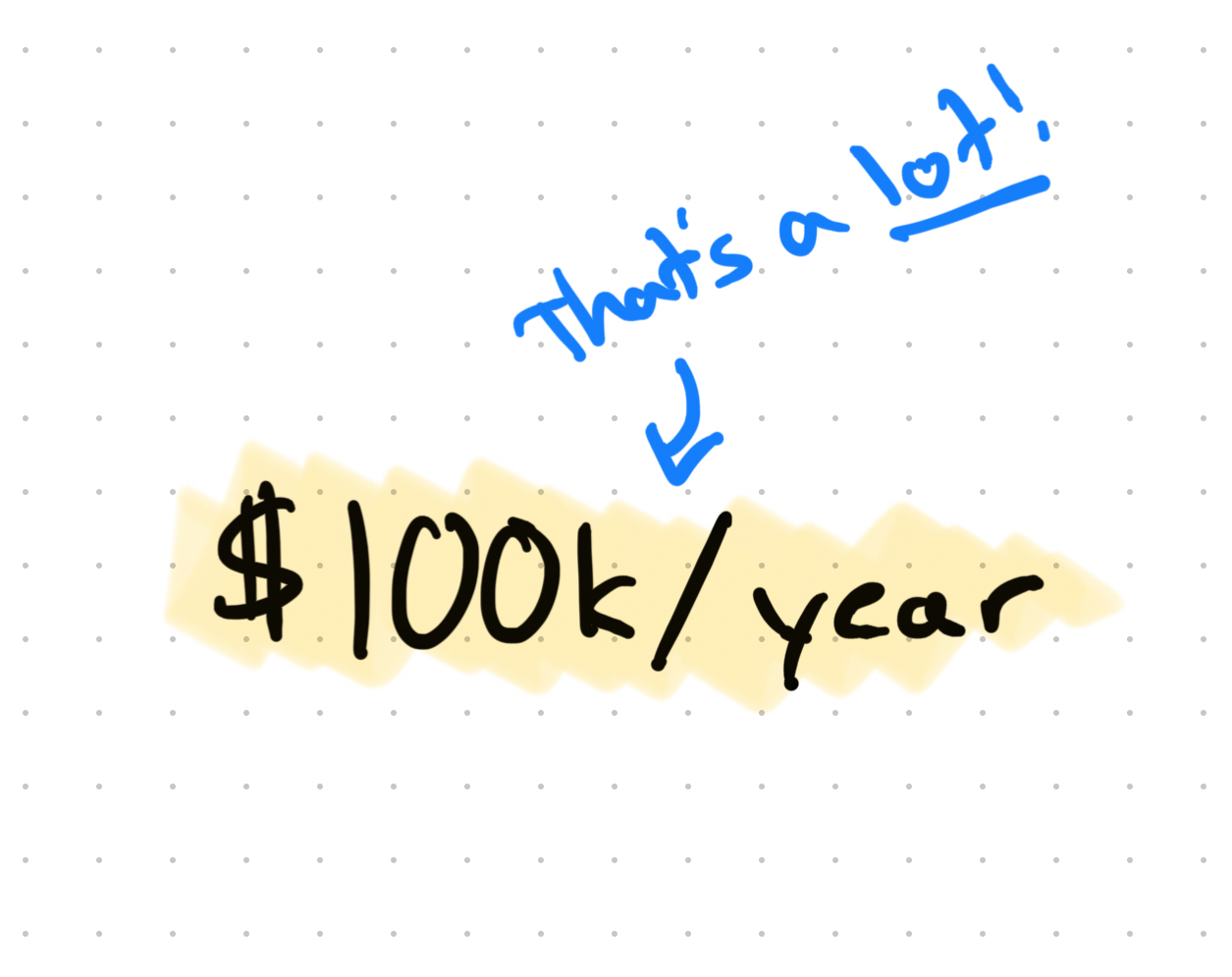
In design, we rarely think about what we're anchoring to. We start with existing patterns, competitor solutions, or our own assumptions about what "good" looks like. But what if we intentionally anchor our perspective to something horrible?
When you establish a genuinely bad reference point, something magical happens. You start to pencil in defined boundaries. You can finally see the difference between “acceptable,” "actually good," and “incredible“ because you understand what "completely broken" looks like.
Without that bad anchor, "good enough" becomes your ceiling. You don't push further because you don't realize how much room you have to improve. But once you've introduced your partners to some truly terrible solutions, the path to breakthrough thinking becomes visible.
The Method: Systematic Questions for Bad Design
This isn't about randomly making things worse. It’s certainly not about shipping bad solutions either. To be productive with terrible design takes intention. I have a few helpful questions that help reveal the edges of any problem space:
- What would make this experience completely unusable? Don't just think "hard to use." Think impossible. What would make users give up immediately and never return?
- What would hide the value so users never feel it? Even if your solution works perfectly, how could you ensure users never realize it's helping them?
- What would utterly destroy user trust? What design choices would make users question your credibility, your motives, or your competence?
- What could make this impossible to find or access? How would you ensure the people who need this solution never discover it exists?
- What would make this take 10x longer than necessary? Not just slow—painfully, unnecessarily, infuriatingly slooooow.
- What would make users feel stupid or frustrated? How could you design something that makes people question their own intelligence?
When I work through questions like these, I typically keep it low-fidelity (and encourage my teams to do the same). Quick sketches with a marker, pencil, or favorite pen. Keep them like rough wireframes on a whiteboard. The goal isn't to build terrible things. It's to understand what makes things terrible. So, don’t spend too much time here, but just enough to learn from it.
Boundary Discovery vs. Constraint Acceptance
Each terrible solution you sketch teaches you something essential about the shape of the problem. Terrible solutions (along with good solutions) help you feel the edges of the problem space you’re interacting with.
Most designers work within perceived boundaries. Things we think are true, but have to assume for lack of information. But until you push against those boundaries and see what actually breaks, you don't know which constraints are real and which are just assumptions to restore comfort in the world of design problem ambiguity.
There's a crucial difference between constraints (what you must work within) and boundaries (what breaks the solution entirely). Constraints are negotiable. Boundaries are not.
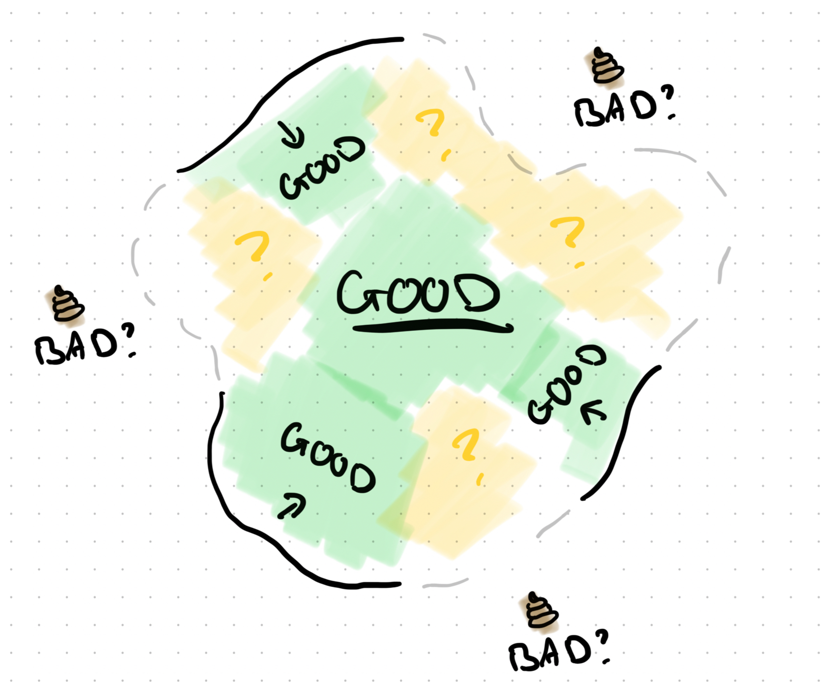
When our team reinvented that workflow in the worst possible way, we learned that the boundaries we thought existed for users were in a different spot. We found that changing input methods and interaction style wasn’t as detrimental as we thought. We became less focused on what was on the screen, and more focused on productive ways for users to input their information.
You're not just making stuff when you explore terrible solutions. You're surveying the territory you're designing within. You're understanding the landscape so you can map it and navigate it with confidence.
The Innovation Connection
This connects to something I've written about before: what do stakeholders want from design? The gist is that in the business rush to eliminate risk and guarantee outcomes, we've made design practice sterile. Many times, design practice isn’t used to solve problems or innovate, it’s used to reduce risk. So, naturally we avoid anything that appears risky or “impossible to validate”. Which means we also tend to avoid anything that might be a breakthrough hit.
Risk aversion kills innovation because it prevents exploration of new ideas that exist on the edges of the solution space. Including ideas that might be perceived as “bad”. However, controlled exploration of bad ideas prevents accidental bad outcomes. It's a little like a vaccine…exposing yourself to a small, controlled dose of failure builds immunity against larger failures later.
You can't push boundaries if you don't know where they are. You can't create genuinely innovative solutions if you're afraid to understand the fine edge between what works and what doesn’t. The sanitization of design has made us allergic to anything that appears like failure, which is exactly what breakthrough thinking requires. Just think of Dyson’s 1,000s of prototypes for the bagless vacuum, or Edison’s 1,000s of filament tests to produce a valuable lightbulb. They weren't simply failing, they were systematically exploring what didn't work to understand what would.
When you deliberately explore a lot of solutions, including the “bad” ones, you're not wasting time. You're doing reconnaissance. You're gathering intelligence about the problem space that will inform every subsequent design decision.
Making It Work Tomorrow
At this point, I hope you’re thinking about how you could get started with this. It doesn’t have to be complex. Just start simple.
Next time someone brings you (or your team) a design problem, spend 7 minutes sketching the worst possible solution. Don't overthink it. Just grab a marker, pen, or pencil and draw something genuinely awful. I mean abysmal. Ask yourself those systematic questions (from above) and see what happens.
Try it as a team exercise. In your next ideation session, say, "Before we explore good solutions, let's spend five minutes mapping what we definitely don't want." You'll be surprised what you discover in just a few minutes. Maybe you can even give the winner a prize?
Jot down what you learn from terrible ideas. They're as valuable as your good solutions because they teach you about boundaries, constraints, and problem edges that good solutions often miss.
Build this into your exploration routine, not as an exception or luxury. Make it a standard part of how you approach unfamiliar problems or early exploration phases. Keep it low-fidelity and time-boxed, and position it as "mapping the problem space" rather than "wasting time." Even 5 minutes is valuable.
This “bad exploration” delivers maximum value when you're dealing with unfamiliar problems, complex user workflows, or situations where you need to communicate risk to stakeholders. It's less valuable for well-understood patterns or incremental improvements where the boundaries are already clear.
Remember: the goal is understanding. You're not trying to create the final solution. You're trying to understand the problem well enough to create a final solution that actually works.
Embracing Productive Failure
So yeah…this is backwards from how we typically think. Designing terrible solutions to become a better designer feels like taking a detour through failure when you're trying to reach success. As you explore terrible solutions, you start building a backlog of what “suboptimal” means in a variety of situations. You fill your bag of experience with solution paths that tend to fail to solve problems in specific types of situations.
It’s a bit unintuitive: the fastest path to breakthrough thinking sometimes takes a journey through the wasteland of terrible ideas. Not because terrible ideas are good, but because understanding what doesn't work gives you clarity about what does.
Design isn't about avoiding failure. It's about understanding what success looks like. And success is made clear when contrasted with failure. When you map the boundaries of bad, the territory of good becomes visible.
Your next design challenge is an opportunity to test this. Take just 7 minutes this week and intentionally design something terrible. Sketch the worst possible solution you can imagine. Ask yourself questions that surface the most painful experience. See what it teaches you about the problem you're actually solving.
You might be surprised by what you discover in the wasteland. And you might be more surprised with how fun it is.