I want to tell you about my favorite apple. It's incredible. It’s hands down the most delicious apple of all time! When you see it hanging on a tree, its color invites you to come closer and take a bite. When it's ripe, the flavor is amazing, complemented with a delightfully pleasing texture. It’s a fantastic fruit that fills you with delight.
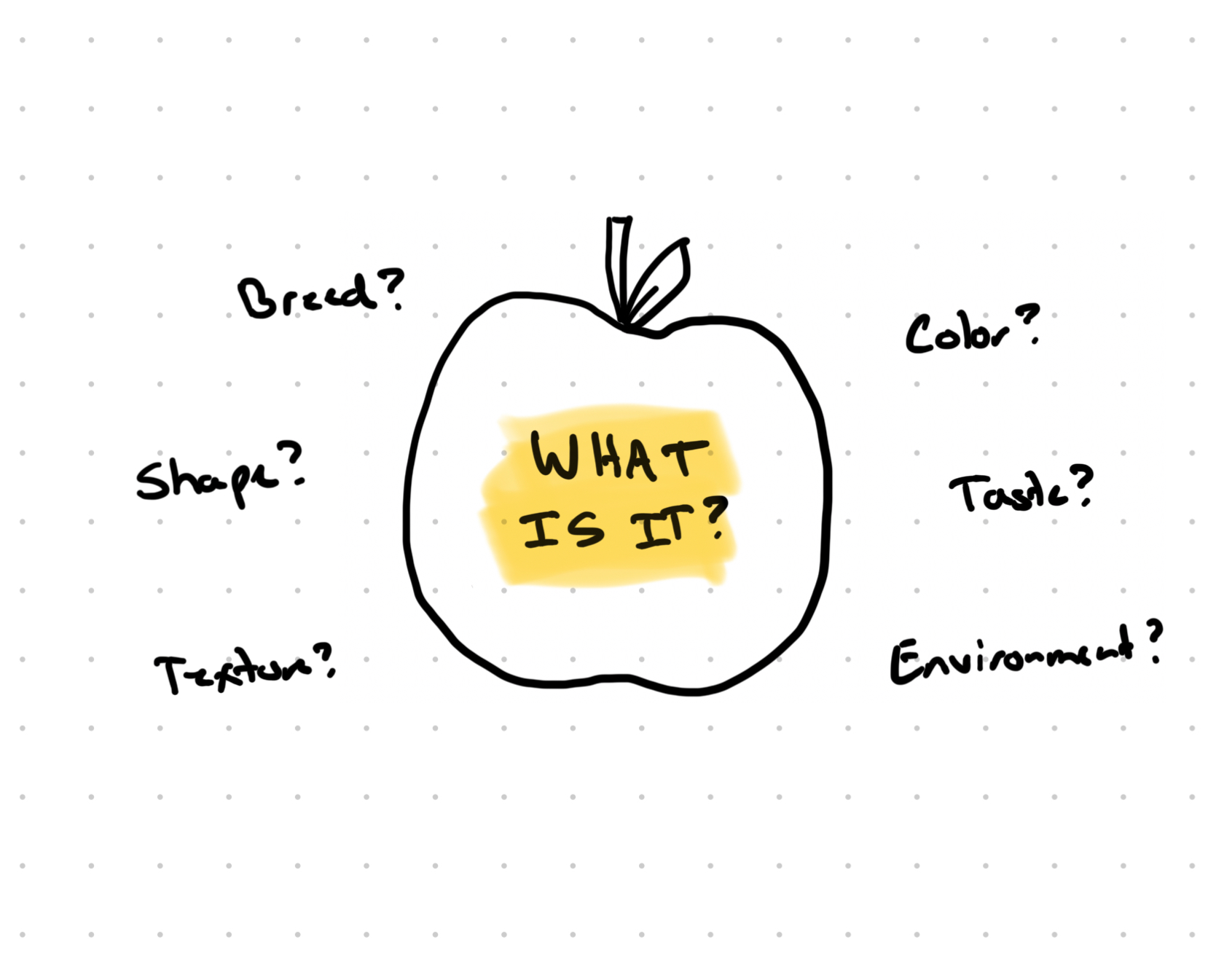
Now, what kind of apple did you imagine? Was it red, green, or yellow? Was the taste tart, sweet, or mild? Where did you imagine that tree…in a field, backyard, or in an orchard? Every person reading this description has a different kind of apple in mind. Yet, we're all speaking the same language, using the same terms to talk about the same apple. The language is the same, but the ideas in our heads are different.
This is what I call the "illusion of alignment," and it doesn’t just happen with apples. It happens all the time in meetings, design reviews, planning sessions, emails, strategy documents and more.
The Illusion in Action
Imagine a product team spends weeks planning a major feature redesign. Everyone attends the kickoff meeting. The product manager presents the strategy doc. It's thorough. It’s well-written. It covers all the bases. Heads nod around the room. Engineering gives a thumbs up. Architecture gives green lights. UX flashes a smile. The scope is clear. The goals are documented. Everyone agrees this is the right direction.
You take notes, ask a few clarifying questions, and get to work. Over the next several weeks, you explore concepts, refine the direction, and build out the solution. It feels good. It feels aligned. The check-ins go smoothly. Then comes the first design review...
The designer presents their work…the culmination of weeks of thinking, exploring, and refining. And the room... erupts. Not with excitement. With confusion. With concern. With frustration.
"Wait, I thought we agreed on something simpler?"
"This isn't what I had in mind at all."
"Why did you go in this direction?"
Everyone feels blindsided. The designer is confused because they followed the strategy, they asked questions, they thought everyone was aligned. The product manager is frustrated at the designer…clearly they didn't read the brief. The leaders are worried…we've lost weeks, and now we have to start over. Engineers are annoyed since they've been planning their work around a completely different approach.
What happened? Everyone was using the same words the whole time. Everyone read the same document. Everyone nodded in the same meetings. But nobody was actually imagining the same thing.

Words Are Squishier Than We Think
Words are not concrete. As much as we want words to have specific, concrete, absolute meaning…they don’t. They're abstractions that our brains automatically fill in based on our backgrounds, expertise, and experiences. Two people can use identical terms and mean completely different things. Two people can use wildly different terms and mean the exact same thing.
This shows up in a few different ways. Here are three examples:
- Semantic misalignment: When a product manager says "simple design," they might mean a specific UI layout. When a designer hears "simple design," they might imagine only showing the primary feature up front. When an engineer hears it, they're thinking about limited implementation complexity. Same words. Three different mental pictures.
- Conceptual misalignment: Consider "improve onboarding." One person imagines a click-through product tour. Another pictures a setup wizard. Someone else is thinking about eliminating steps entirely. Everyone agrees we need to "improve onboarding," but nobody clarifies what that actually looks like.
- Strategic misalignment: Look at strategic language like "increase engagement." Does that mean getting more clicks? Increasing unique user traffic? Bolstering user retention over time? Or something entirely different? You can get an entire leadership team to agree that "increasing engagement" is the priority, and they'll all leave the room with completely different visions of success.
The problem gets worse with documentation. We write things down and feel confident. Look, it's right there on the page. It's clear. It's specific. But even detailed specifications get interpreted through different mental models. Your brain reads those words and instantly constructs an image based on what you know, what you've seen before, and what makes sense to you. Our brains make assumptions about the words and between the words to make sense of what we’re reading.
This isn’t because people are stupid or careless. This is human nature. It's just how our minds work. It’s how we engage with and understand the world. We can't help but fill in gaps with our own understanding.
The Division It Breeds
Before that design review, everything feels fine. There's harmony in meetings. People are nodding. Documents are approved. Progress is being made. High fives all around. But underneath, an invisible gap is slowly widening. Everyone is building on different assumptions, creating different mental models, imagining different end states, and digging a deeper gulf between each other.
Then the designer shows their work and suddenly the gap becomes visible. What felt like alignment evaporates like a vapor. That alignment was simply an illusion.
Trust erodes. The designer feels like the goal posts just moved. The product manager feels ignored. Developers feel annoyed. Everyone questions everyone else's competence. What was a collaborative team suddenly feels like a war zone.
We don't just have a project setback, we have a relationship problem. People start documenting everything defensively. Politics emerge. Finger-pointing begins. The project screeches to a halt as everyone grasps for control of the situation.
This is what survival looks like. Everyone is genuinely trying to do the right thing. The division wasn't intentional, it was invisible…until the pictures showed up.
Designers as Bridge Builders
The pictures. That’s where clarity started to emerge. This is where designers have a unique opportunity. We think visually (or at least we should). We externalize ideas in renderings to make sense of them. We don't just imagine solutions in our heads, we sketch them, analyze them, erase them, trash them, and sketch some more. We refine them, prototype them, and make them feel more real. We make the invisible visible.
This puts us in a very opportunistic position. We can expose misalignment before division deepens. We can build bridges between abstract language and concrete forms. We have a chance to drive direction and clarity. We don't need special authority or permission. We don't need a "seat at the table". We just need to do what comes naturally to us: draw.
A designer with a marker and a napkin can create more alignment in 1 minute than weeks of documented strategy. Not because the strategy is bad, but because the drawing makes everyone's different mental pictures visible. It forces the misalignment to the surface early, when it's still easy to correct. It grounds us in what could be, to drive the question of what should be.
This isn't about gatekeeping or controlling the conversation. It's about getting people to talk. It's about helping everyone see the different pictures in each other's heads so we can get really get aligned before we waste time, money, and relationships building the wrong things.
Tactics for Creating Real Alignment
This should be second nature for designers. But, it's easy to get sucked into the practices and thinking of non-designers around us.
If this is new to you, or you're looking for some helpful approaches, here are practical ways designers can use visual thinking to build bridges across different scenarios:
- Strategic alignment: Remember "increase engagement"? This is strategic misalignment in action. When leadership is discussing vision or priorities, sketch competing interpretations right there in the meeting. "So when we say 'increase engagement through product adoption,' do you envision something like this, or more like this?" Draw two quick options. Very loose, very basic. A few boxes and lines. Label them with the thinking behind each one. Watch how quickly the conversation sharpens. You may get called out for "solutioning" too early, but if you pose it as a "thinking tool" then people may be more inclined to engage. You can also create visual roadmaps that show what parts get built when, not just lists of features. Storyboard the customer journey you're enabling.
- Project alignment: This is where conceptual misalignment lives, where "improve onboarding" becomes three different visions in three different heads. In kickoff meetings, respond to the abstract discussion with quick sketches. "Here's what I heard, is this what you mean?" Even napkin-quality drawings increase clarity. Draw the "before and after" states together as a team. Hand the marker to your collaborator. Get everyone sketching, even if they protest they "can't draw." The goal isn't art, it's shared understanding. Use rough, marker wireflows before wireframes to align on user flow without getting distracted by UI details. Focus on the purpose of each screen rather than the details.
- Review alignment: This is semantic misalignment territory, where "simple design" means three completely different things to three different people. Show multiple directions to surface what people actually mean by words like "good" or "simple" or "clean." When you present only one option, people critique it against the different pictures in their heads. When you show two, it can create a false binary choice. When you show three options, people start talking and hidden assumptions become visible. Use a deliberately "unfinished look" to keep the focus on concept alignment rather than polish. And flip the script: hand the marker to your stakeholder and ask them to sketch what they're imagining or what they'd change.
The goal of these isn't to finalize decisions. It's to avoid hidden assumptions and misalignment that will paint you into a corner later and undermine the value you're delivering to users.
Just Draw a Picture
Remember our favorite apple from the beginning? The one we imagined differently even though we used the same language? It looks like we’re aligned because we’re talking about an apple. Even if we start talking about details, we still appear to be aligned. It’s not until concrete renderings are introduced that the true state of alignment is shown. This is where the practice of design shines. Every strategy session. Every kickoff. Everyone's got a different apple in their head. We can help draw it out.
This doesn't require process overhaul, you can do it any time. It doesn't need expensive tools, you just need a pencil. It doesn't require anyone's permission, just some courage on your part. We need to do what comes naturally to designers: think visually. Make ideas concrete. Turn words into form. Show, don't just tell.
There’s been a lot of talk over the years about designers needing a seat at the table. I don’t believe you need to be at the table to influence the people at the table. You need to create artifacts that create shared understanding, and show the path forward. You need to be the one who makes what's invisible visible before the division breeds and relationships fracture. If everyone at the table is aligned going in, you don’t have to be there to try and align them.
We're surrounded by a world addicted to speed and productivity. Some may think drawing is a waste of time, or inappropriate for "serious business discussions," or something you do later in the "design phase." They won't naturally reach for a marker. But we will. Because we're the ones who instinctively know that pictures are worth 1,000 strategy documents, and pictures create the concrete to help us understand the wicked problems we’re asked to solve.
Next meeting, bring a sketch. Even a crude one. Spend 5-10 minutes thinking with your pencil and be ready to share. Be the bridge builder. Be the one who weeds out hidden assumptions by creating alignment.
Pickup your pencil, and get after it!
One More Thing…
You may get really frustrated when you spend time and energy understanding the problem and proposing a solution only to have it ripped apart over and over again. Or you may work hard on identifying and rendering the best solution and people tell you all the reasons why it’s wrong. You may get frustrated after months into a project and things suddenly go sideways and your project partners decide that it’s the “wrong“ direction.
It’s a horrible feeling and one of incredible frustration. It might feel like you can never get anything right. But I want you to know: as a designer that’s your job. It’s our job to propose and work through solutions and constantly be searching and rendering our thinking. We make the intangible tangible so people can understand it. You make the intangible tangible so we can build it if that’s the agreed path. If you propose a solution, or many solutions, and people disagree, you’ve done your job. Consider it a success if you draw a picture or prototype and people disagree with it. That’s your opportunity to find alignment and find the path forward.